
Most categories are built from habit, internal politics, or gut feel, and then everyone acts surprised when entrants don’t know where they fit. The answers were in your data the whole time.
Your award categories are probably designed from the inside out, built around what your team thinks is trending, what sponsors want, and what’s always existed, rather than how your market actually describes itself. That mismatch is why entries cluster in three categories, why half the programme feels thin, and why entrants keep asking which one they should be in.
But we’ve got you. And we’ve got you a list of six signals that tell you exactly which categories to keep, merge, rename, split, retire, or create, based on your previous year’s signals.
What’s the real problem with award category design?
The truth about award category design is that most programmes treat it as an internal opinion exercise, not a product design problem.
But categories are a product. They’re the primary interface between your programme and your market. Entrants use them to decide whether your awards are relevant to them, whether they can win, and whether the effort of entering is worth it. If that interface is confusing, they leave. If it doesn’t reflect how they think about their own work, they don’t see themselves in it.
The typical category design process gets this backwards. It starts from the inside, what the team thinks is trending, what sponsors want visibility in, what’s always existed, and works outward. It almost never starts from the question: how does our market actually describe itself, and do our categories match that?
The result is predictable:
- Categories too broad to feel meaningful (“Excellence in Business”)
- Categories too narrow to fill (“Best Use of AI in a Sub-10-Person FinTech Startup”)
- Category language borrowed from industry body definitions rather than entrant vocabulary
- Boundaries between categories that make sense internally but create genuine confusion for anyone outside the team
And the clearest proof that this has happened? When “which category should I enter?” becomes a support question. That question should never need to be asked. If it is, the category didn’t do its job.
The Business of Awards: 2026 Industry Insight report, based on a cross-stakeholder survey of organisers, sponsors, entrants, and judges, found that only 13% of awards stakeholders describe judging as very transparent, with almost a third describing processes as opaque or very opaque. When that much of your market already questions the integrity of what you’re running, poorly designed categories that confuse and misdirect entrants are a material risk to your programme’s credibility.
What are most teams actually working with, going into a category review?
Going into a category review, here’s what most awards teams are actually working with: a spreadsheet showing how many entries each category received, some anecdotal feedback from judges, an instinct informed by experience about what performed well, and a set of pressures from sponsors, from long-standing programme partners, from senior stakeholders who have opinions.
What’s rarely available, even though it technically exists somewhere, is the behavioural data. Where did entrants drop off? Which categories saw people start and not finish? How often did your team have to move entries between categories because someone chose the wrong one? Which support questions came in repeatedly during the entry window, and about which categories?
That data is sitting in your portal export, your ops inbox, your support ticket system, and your email analytics. It’s just not been synthesised into decisions.
As a result, the category changes happen based on whoever argued most confidently in the meeting. And when entry season arrives, you find out whether they were right, at which point it’s too late to do anything about it.
There’s a better way to run this, and the inputs you need are already there from last year.
Six signals that tell you exactly what to change
These are specific, awards-native signals that most programmes generate whether or not they’re paying attention to them. Each one maps to a concrete category decision: keep, merge, rename, split, retire, or create.
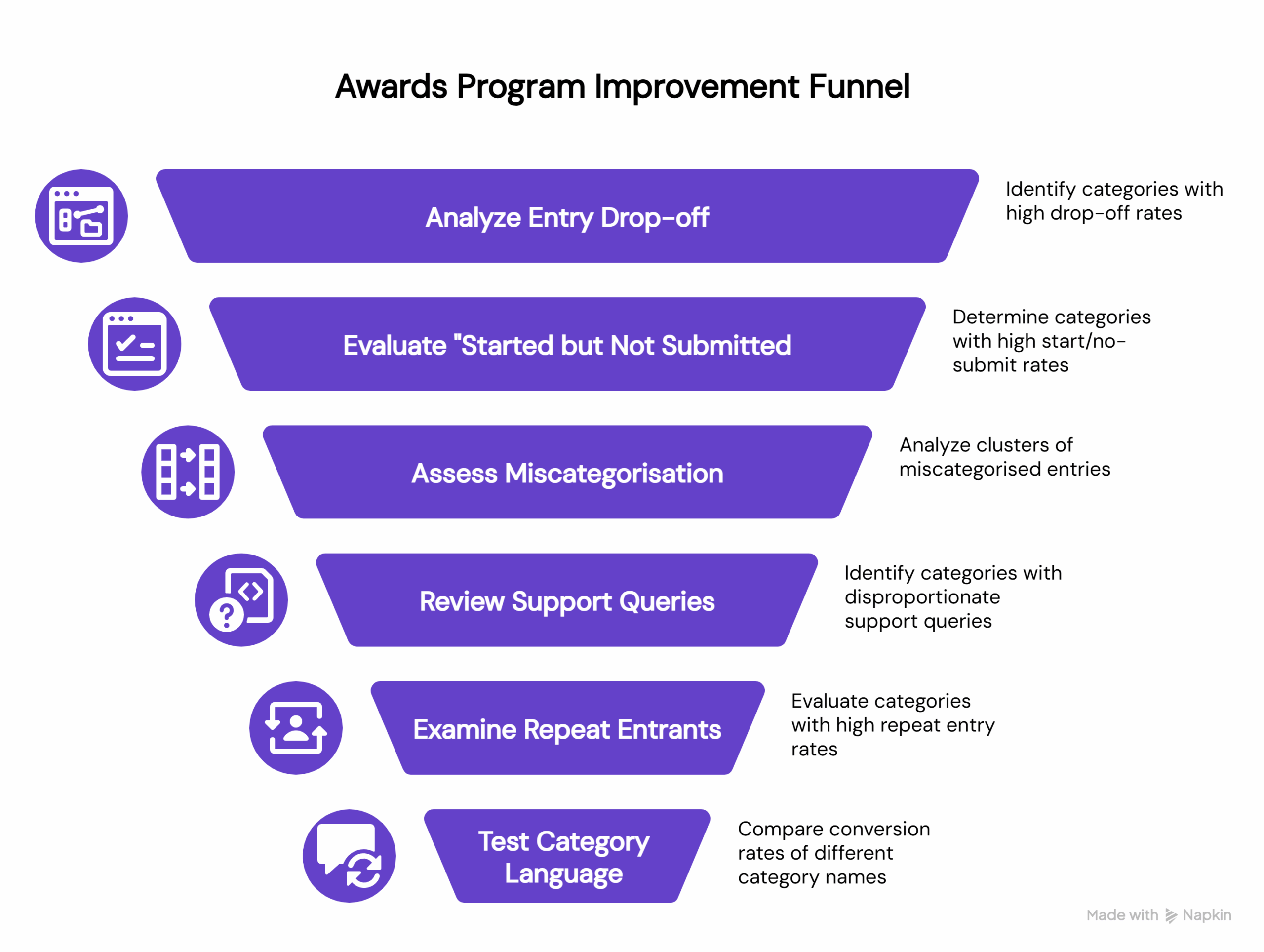
Signal 1: Where entrants drop off in the entry journey
Every awards portal generates some version of this data, stage-by-stage completion rates by category. The question is whether anyone looks at it with category design in mind.
Consistent drop-off in a specific category is almost never about motivation. The entrants started. They were interested enough to begin. Something in the process itself caused them to leave.
Usually, it’s one of two things. Either the category attracted people who, once they got into the entry form, realised the criteria didn’t match what they’d done. Or the effort required, the word count, the evidence requirements, and the number of questions felt disproportionate to the category’s perceived prestige or relevance.
Both of those are design problems. Not marketing problems. Don’t solve a design problem by promoting the category harder.
The decision this signal drives: If drop-off is structural and consistent (not just one bad year) that category needs either clearer scoping, a criteria rewrite, or a harder look at whether it’s attracting the right people in the first place.
Signal 2: Which categories have the highest “started but not submitted” rate
This one is distinct from general drop-off, and it’s the signal I find most telling.
“Started but not submitted” means someone invested real time. They sat down, read the questions, and started writing answers. They got far enough in to have a genuine relationship with this category. And then they didn’t submit.
That’s your highest-regret cohort. These are motivated, engaged entrants who hit something that stopped them at the last moment. The most common causes: the category description didn’t quite match what they’d written when they got into it; the word limits felt punishing relative to other categories; or they second-guessed their fit and didn’t want to enter and lose, so they just didn’t enter.
And this matters because the recovery window is almost nonexistent. Research shows that only 20% of people who abandon a form will follow up with the organisation at all, and over 67% who encounter confusion leave permanently without making contact. That means if someone starts your awards entry and doesn’t submit, there is no email campaign that recovers them if the underlying problem is that they didn’t know whether they were eligible. They’re gone, quietly, and you’ll never know why.
Look at what was happening in your support queue during the same window. If there’s a spike in “am I eligible for [Category X]?” questions alongside a high start/no-submit rate, that’s a language problem, not a motivation problem. The category name or description created ambiguity that lost you the entry at the finish line.
The decision this signal drives: Rename before you remarket. Clearer eligibility language in the category description will recover more completions than another email campaign.
Signal 3: Where miscategorisation clusters
This is one of the most underused signals in awards programme management, partly because the data lives in a very unsexy place: the notes from your entries team when they reassigned a submission to a different category before shortlisting.
Every instance of miscategorisation is a data point. It means an entrant looked at your category list, made a choice, and your team or judges concluded they’d chosen wrong.
When this happens in clusters (consistently, between specific pairs of categories) it’s telling you something important. Either the boundary between those two categories isn’t meaningful to entrants (in which case, should they be one category?), or the language describing them doesn’t reflect the distinction your team sees (in which case, the descriptions need rewriting to make that distinction visible).
There’s a version of this that’s particularly instructive: when entries regularly move from a high-status, well-branded category into a more specific one. That’s often a signal that the broader category is functioning as a catch-all, diluting it and frustrating the entrants who actually belong there.
The decision this signal drives: Clusters of miscategorisation between two specific categories usually indicate these should be merged, or that both need to be rebuilt around a clearer organising principle. Map the flows. The picture becomes obvious quickly.
Signal 4: Which questions spike in your support queue
Pull your support inbox from the last entry window, tag every query about category selection, and then count them by category name.
What you’ll find (almost always) is that the volume isn’t evenly distributed. A small number of categories generate a disproportionate number of “where do I fit?” questions. Those categories have a design problem.
Every support query about category fit represents a motivated entrant, someone engaged enough to reach out rather than just leave, who couldn’t self-serve the answer from the category listing itself. The category didn’t answer the implicit question every entrant is asking: Is this for me?
This pattern is well-documented beyond the awards world. Research from the Nielsen Norman Group found that missing or unclear information is the single most common reason people contact support, accounting for 38% of contact reasons. When someone emails your awards team asking “which category should I enter?” they’re not disengaged or indecisive. They hit a language gap and didn’t want to guess wrong.
This signal also gives you something beyond the category name: the language entrants use when they’re confused. How do they describe their own work when they’re trying to figure out where they belong? That language is often more revealing than anything in your category descriptions, because it’s unfiltered.
The decision this signal drives: Any category generating a disproportionate share of “which category?” queries needs a description rewrite at a minimum. If the confusion is fundamental rather than linguistic, if people genuinely can’t tell whether they belong, that’s a structural problem, and a rewrite won’t fix it.
Signal 5: Which categories attract repeat entrants
Look at how many of your entrants have entered the same category across multiple cycles.
Repeat entrants are the best evidence you have that a category has genuine, sustained relevance to a defined audience. They came back, and they found their home in your programme. That’s rare, and it’s valuable.
These are your anchor categories. Even if their entry numbers aren’t the highest, even if they don’t generate the most press interest: protect them. The entrants who return year after year are often also your most vocal advocates, the ones who tell their peers to enter, the ones who care whether your programme is credible.
There’s a corollary to this worth noting. The categories with low repeat entry rates, where most entrants are first-timers who don’t come back, are worth interrogating. Sometimes that’s healthy growth. Sometimes it’s a signal that the category experience didn’t live up to expectations, and they didn’t feel compelled to return.
The decision this signal drives: Protect your repeat-entrant categories. If you need to rename or evolve them, use the language from those entrants’ submissions to guide the new framing, they’ve already told you how they talk about their own work.
Signal 6: Which category language actually converts
Category names are copied, and they have to do a specific job: convert someone who’s browsing your awards website into someone who starts an entry.
And like all copy, some language works better than others. “Best Employer” consistently outperforms “Excellence in People Practice.” “Scale-up of the Year” pulls harder than “Growth Business Award.” These differences aren’t arbitrary; they reflect how people self-identify versus how industry bodies define them.
The evidence for this is real. Melissa Irving, Group Events Director at emap, describes relaunching the British Construction & Infrastructure Awards after three consecutive years of declining entries. One of four relaunch levers was a category language refresh, updating terminology to better reflect how the market described its own work. A change from “Initiative” to “Impact” in a category name might seem subtle, as she describes in the Business of Awards: 2026 Industry Insight report, but it resonates differently with the people you’re trying to reach. The outcome was record entries and stronger brand equity.
That result is consistent with a wider finding from the same report: 75% of business leaders say they don’t know where to find the right awards or how to judge their credibility. If the majority of your potential entrants are already uncertain about whether your programme is worth entering, a category name that doesn’t clearly signal relevance is the last friction point they need.
The decision this signal drives: If two comparable categories perform very differently on click-to-entry conversion, test whether the higher-performing category’s language is transferable. Category names should reflect how your market talks about itself, not how your team defined the sector in 2019.
The truth that might be too bitter: changing categories is political
Let’s not pretend otherwise.
Category changes trigger opinions. Sponsors have preferences. Judges have built expertise around existing structures. Long-standing programme partners feel ownership over categories they’ve won before. Senior stakeholders conflate “retiring a category” with “admitting it was a mistake.”
But there’s a difference between stability and stagnation. The most resilient awards programmes treat category design as a continuous optimisation exercise, reviewing every cycle, refreshing language, and evolving criteria, rather than a once-in-a-decade reinvention. The evidence from programmes running at scale is consistent: the teams that do this well are the ones avoiding thin entries and confused support queues in the first place.
The signals above aren’t an argument for radical reinvention. They’re an argument for evidence-based iteration and that’s a much easier conversation to have with stakeholders than “we think we got it wrong.”
Here’s some language worth using when you’re proposing signal-driven category changes:
“We’re not changing categories for novelty. We’re reducing friction and improving fit based on last cycle behaviour. The goal is the same (a strong, full programme) the method is just more rigorous.”
“We’ve identified three categories where entrant confusion is costing us completions. This is about protecting the quality of the programme, not reinventing it.”
“We’re proposing a rename, not a retirement. The audience this category serves is still here; we just need to speak their language.”
The key reframe is this: you’re not asking stakeholders to trust your instinct over theirs. You’re showing them the data and asking them to respond to it together. That’s a much more defensible position, and a much easier conversation to have.
The categories you design this year will shape everything downstream
Get them right, and you’ll see it everywhere: higher entry volumes in the categories that matter, fewer confused support queries, cleaner shortlists, stronger sponsor alignment, and more repeat entrants.
Get them wrong, and no amount of promotion fixes it. You can’t market your way out of a design problem.
The signals from last year’s programme are the clearest brief you have for this year’s category design. And they’re a lot more reliable than the loudest voice in the room.
Bridged has built a suite of playbooks purpose-built for awards and recognition programmes, covering everything from activation and conversion to sponsor maximisation and ops deflection. If you’re running an awards programme and want to see how these playbooks apply to your specific context, explore the full suite below.